Today's top news:
a new experience.
Today's top news:
a new experience.
Dagens industri
My role Product Designer
For three years we've migrated our digital products to a new platform, through this process it's been a goal to bridge the gap between our physical and digital products. The visual design has been improved, as has the user experience for our readers. We have also developed new features such as storytelling (long read) articles, new stock list pages, my favourite stocks list, and introduced our design system.
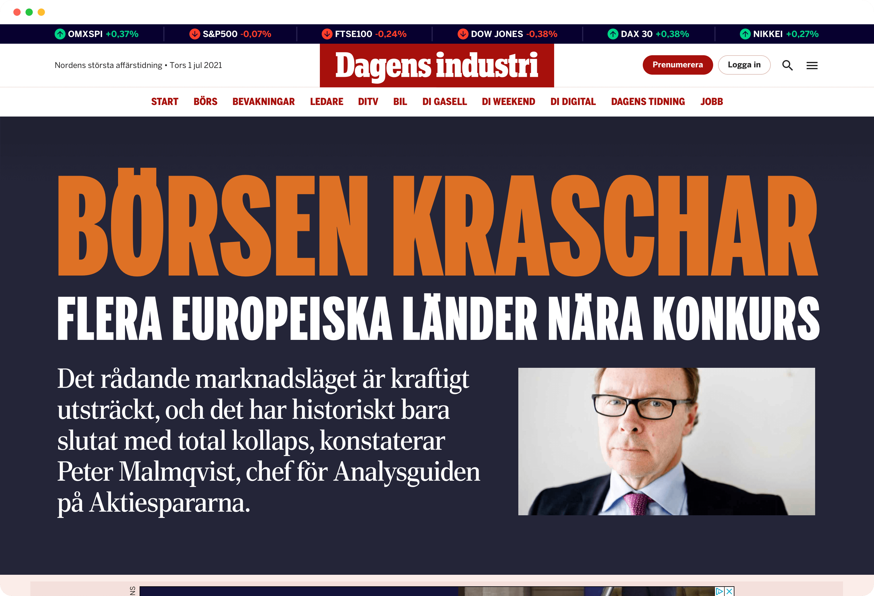
The new header
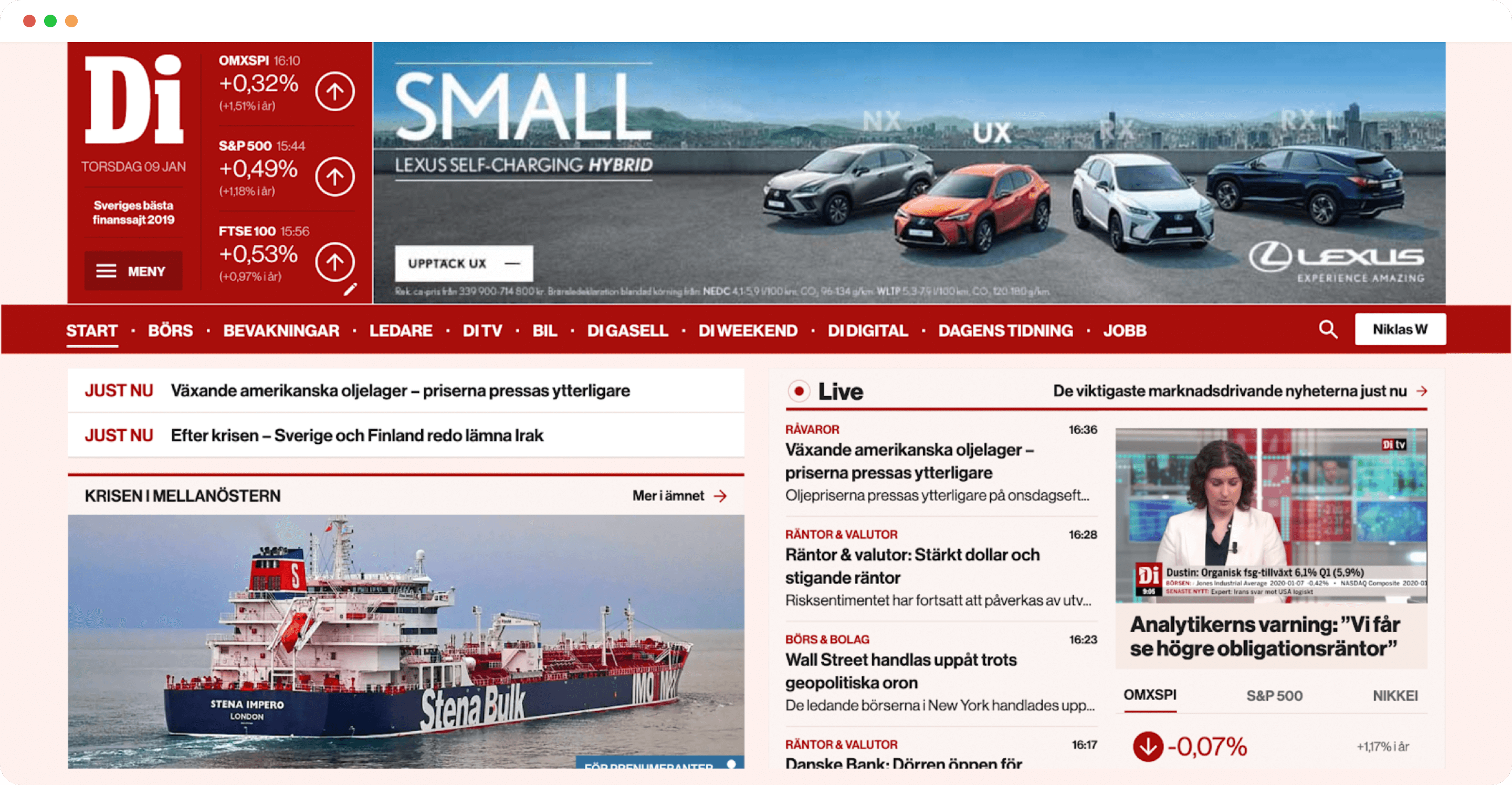
As with all products around us, it is important that the user experience is consistent no matter where our readers meet us. Our main site, Di.se, used to show more than four different headers depending on what kind of reader visited the site (e.g. subscriber, anonymous reader). Looking deeper into Di's websites it turned out that the reader could meet more than 15 different headers across the brand. Ouch.
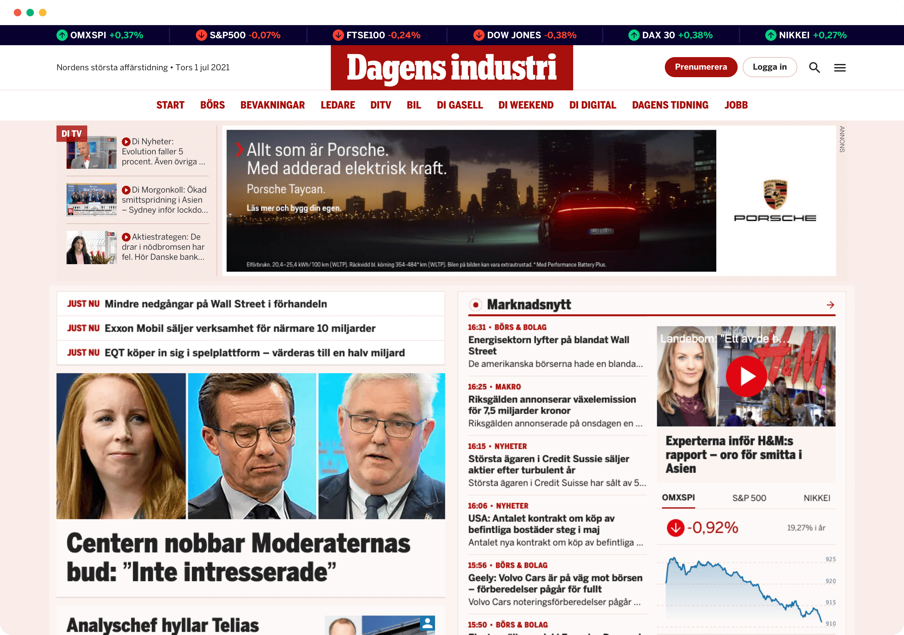
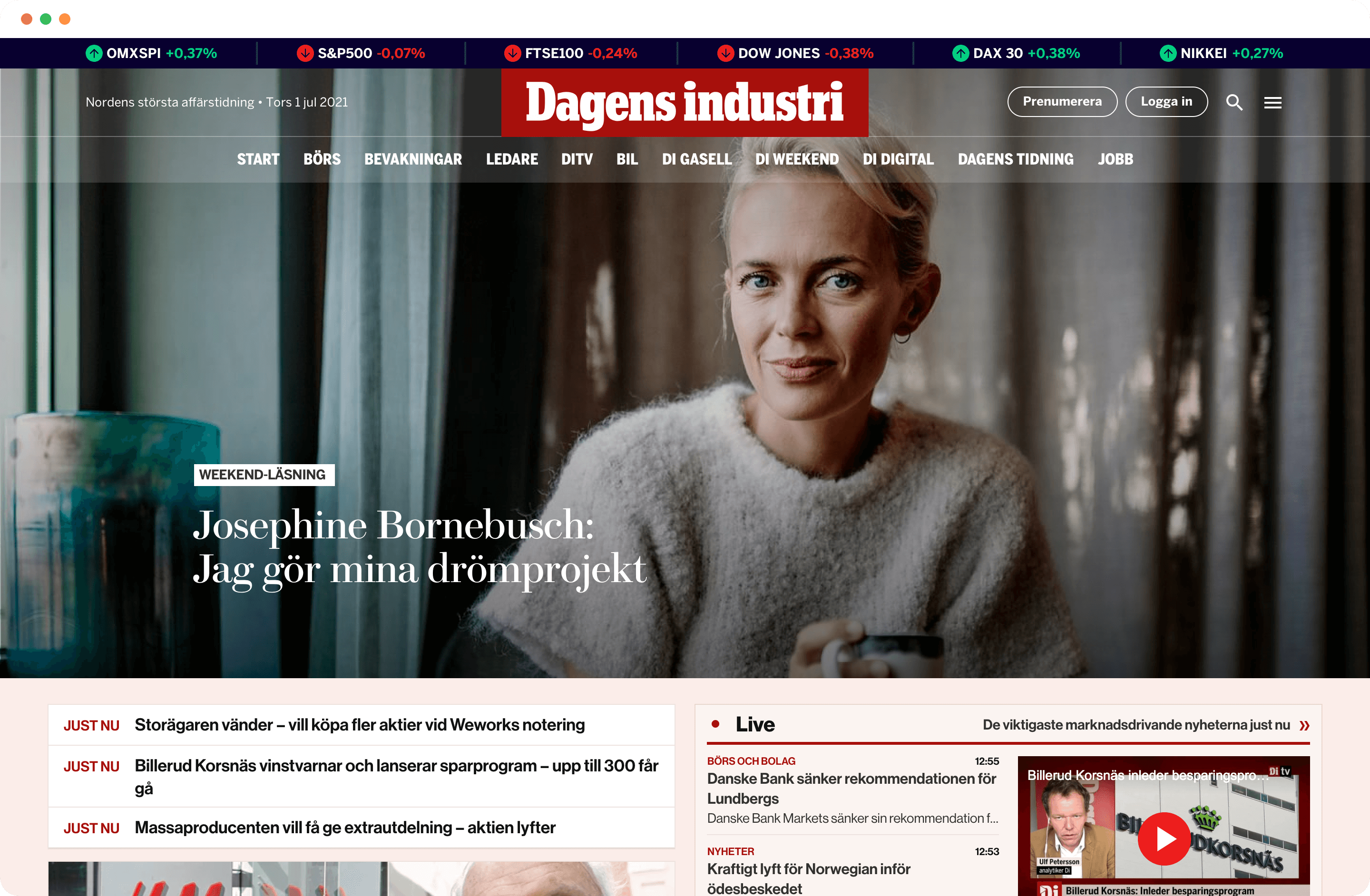
We streamlined and improved the headers with an updated, more modern design to improve our readers' experience across di.se. From a business perspective, the banner needed to be kept as it gives us a great income.
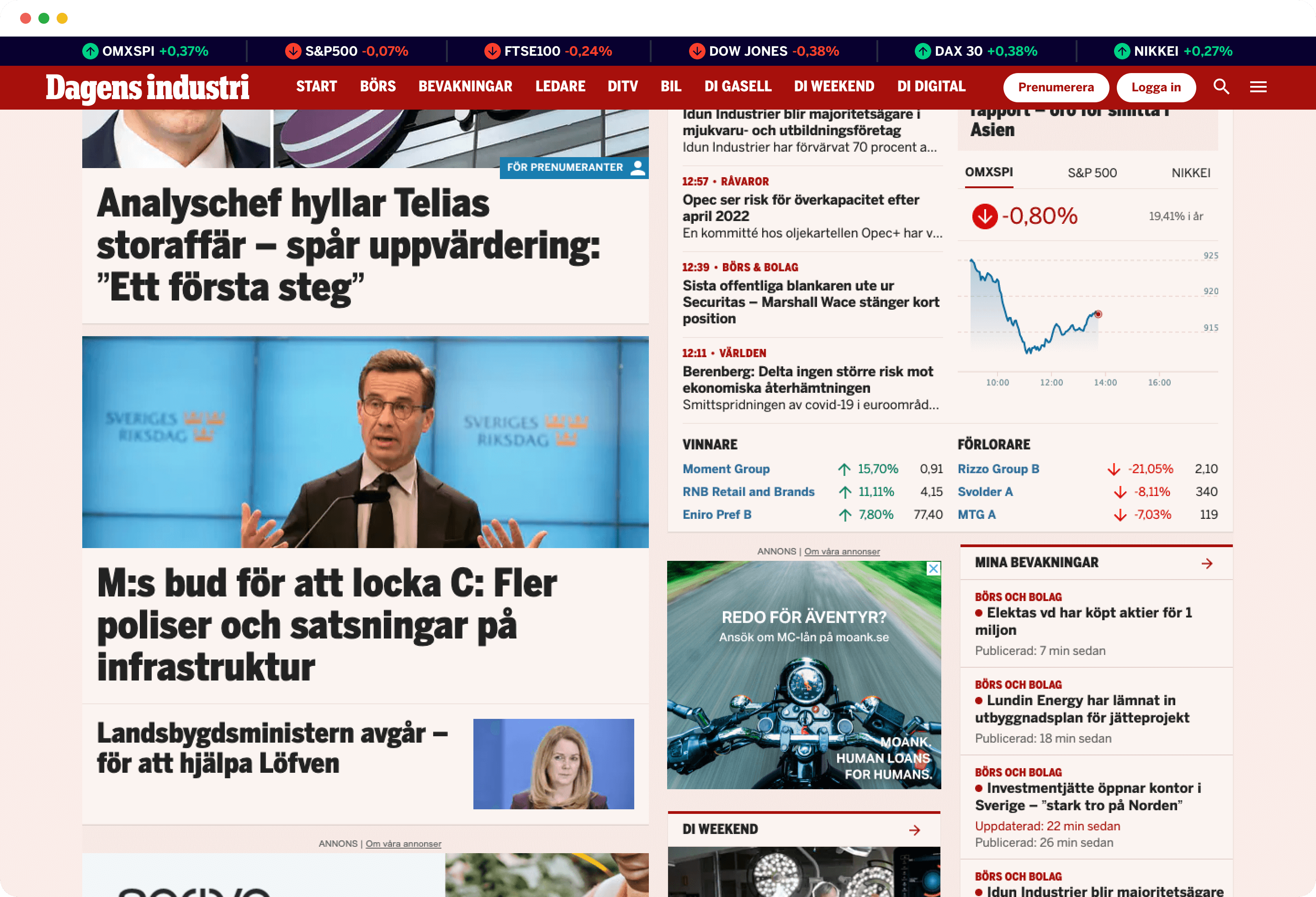
The white header, shown on the landing page, is inspired from our physical product. The stock data is presented at the top of the header, and connects with the design shown in the stock market section of the website. As the reader scrolls and browse the news, the header minimises and the banner disappears. The minimised header is used on all sub pages. The headers on our sub websites will be updated later on.
Header / Before
Header / After
Minimised header during scroll
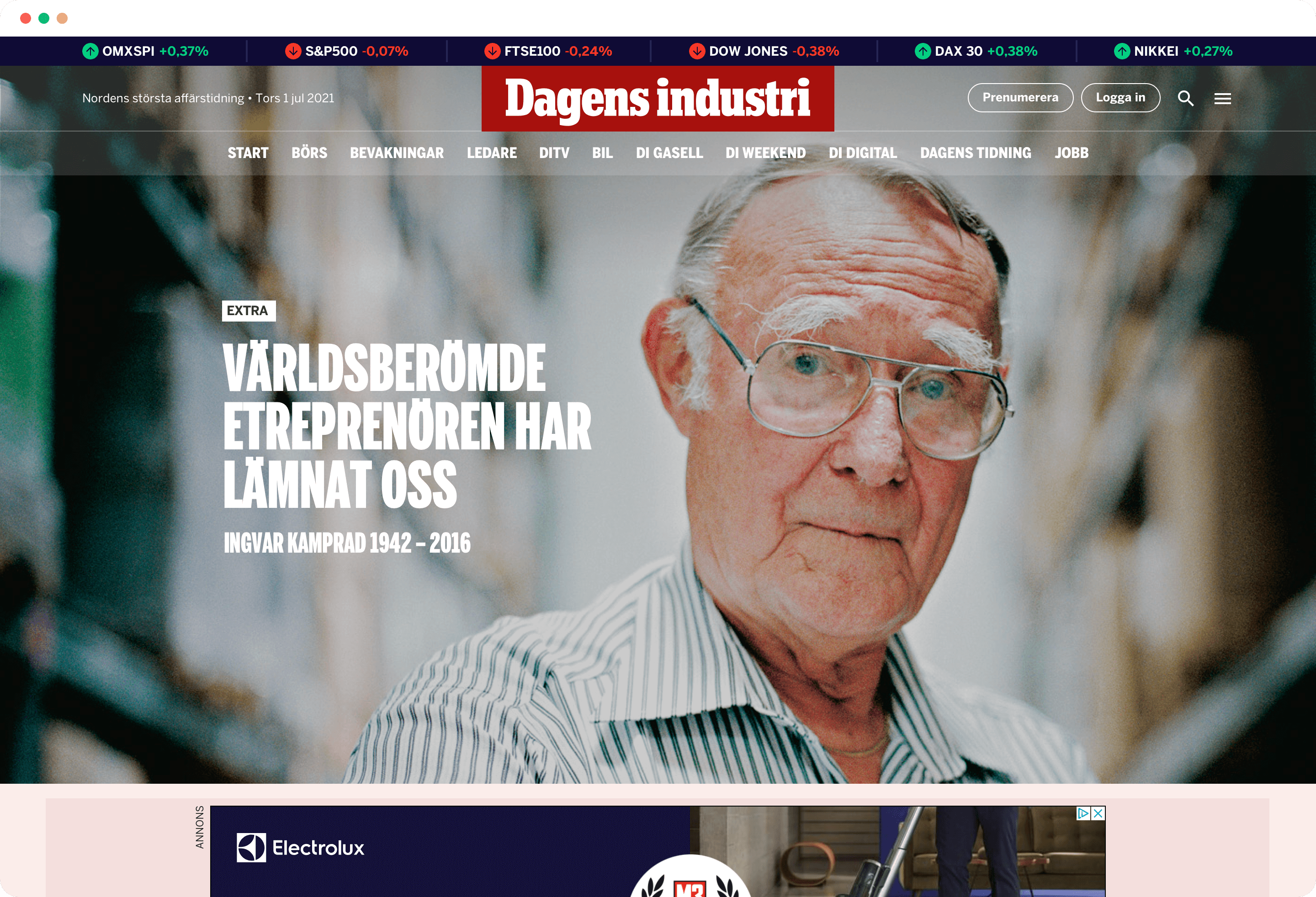
Concept: Hero space – Top news
As we were conceptualising the header, we also did sketches of a new hero space that could be shown during top news, or in the weekend.
As we were conceptualising the header, we also did sketches of a new hero space that could be shown during top news, or in the weekend.
Concept: Hero space – Top news (typography)
Concept: Hero space – Feature article
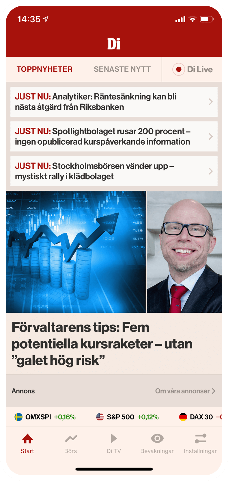
The app
The readers using our app are our most engaged users. Compare to our website readers, our app readers browse the news more often, their sessions are longer, and they read more articles. No matter if our readers are using our website or app, our goal is to give them the very same experience – the Di experience. We're not quite there yet but slowly and steady we are getting closer to our goal.
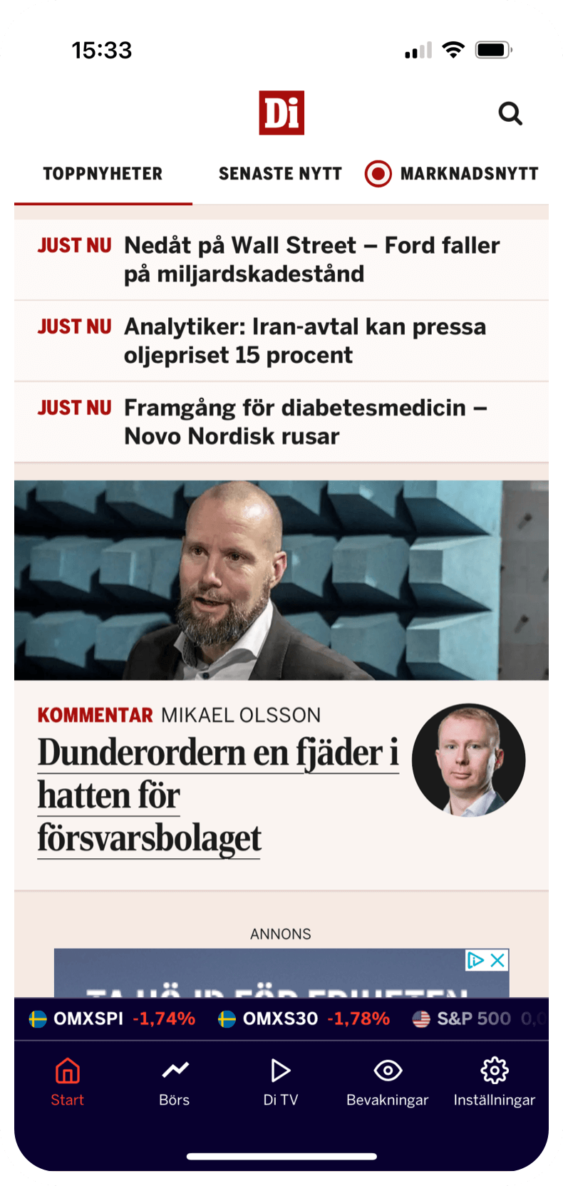
This year the app has been updated to follow our design system, i.e. components, typography, icons, etc has been updated. Earlier this summer we released dark mode. To keep Di's identity even in the dark, we let our stock market brand colour, dark navy blue, replace light pink as a background colour.
Later on this year we will release a new navigation that will help our readers to reach all content that are available on our website.
Start screen / Before
Start screen / After
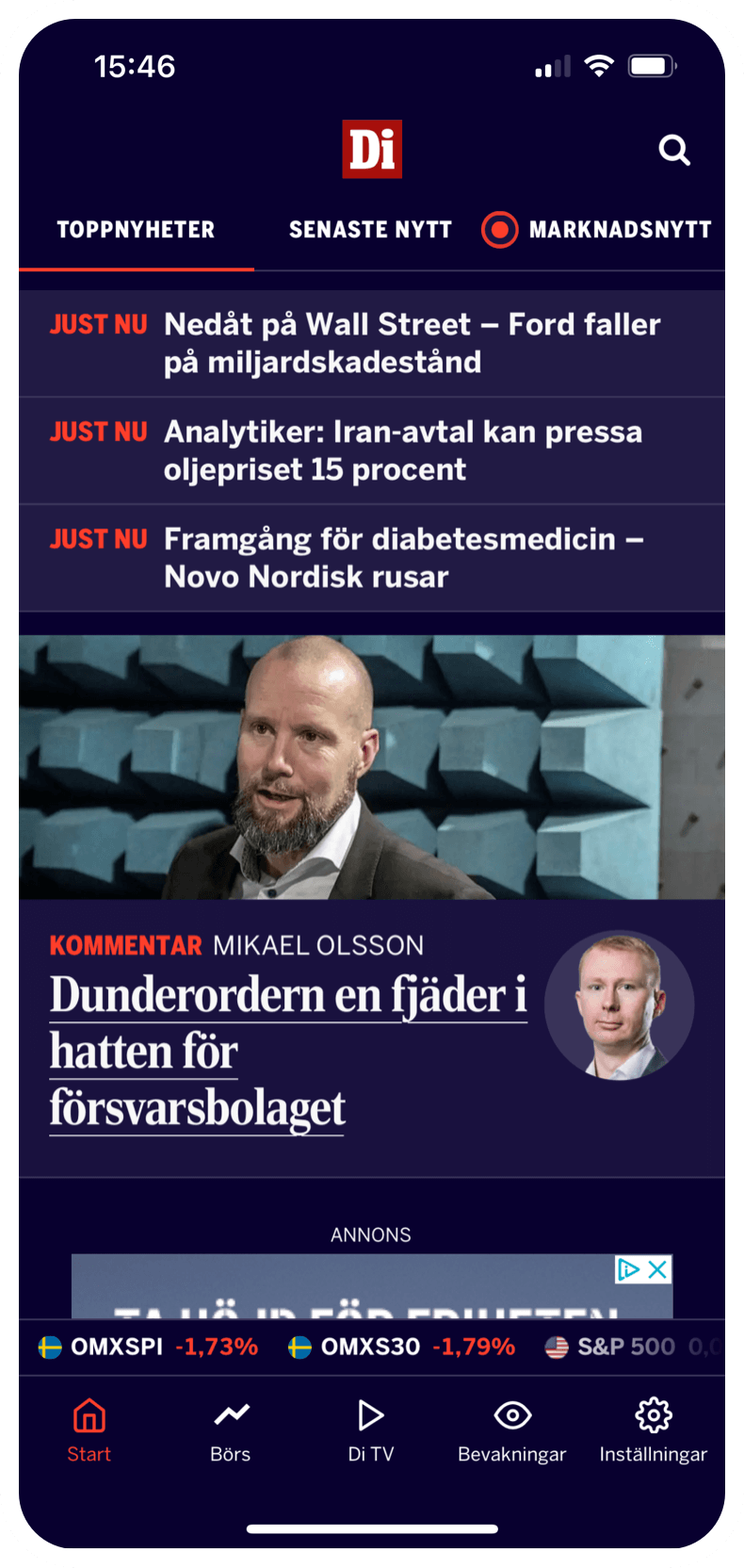
Start screen Dark / After
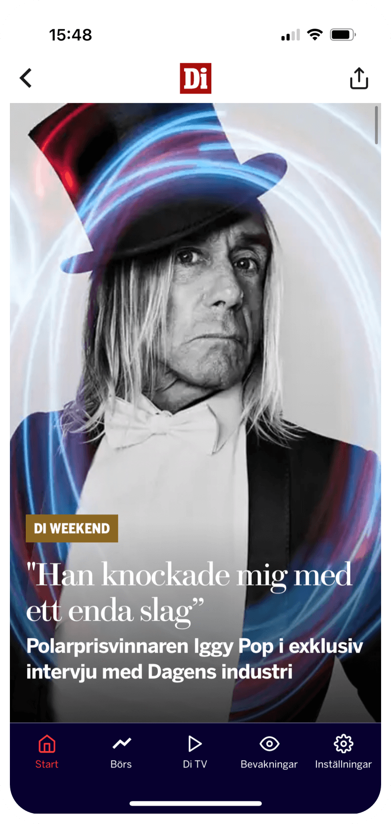
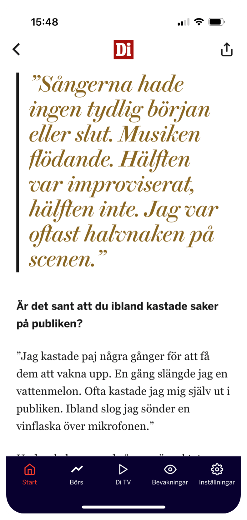
Storytelling article
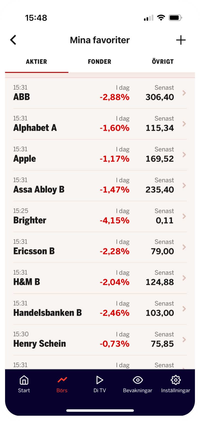
My favourite stocks list
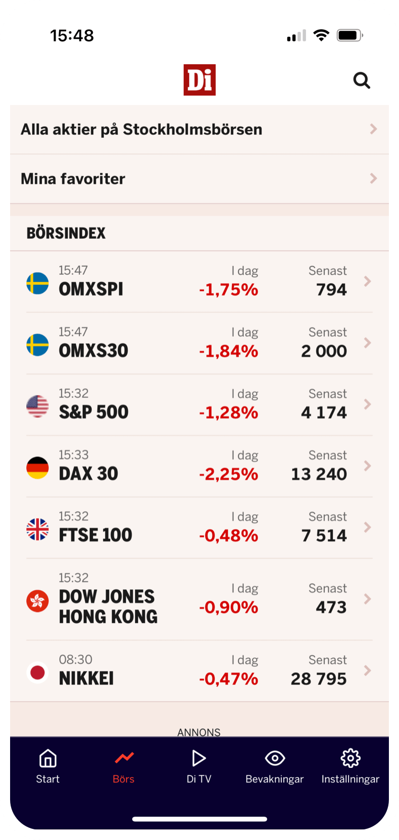
Stock overview screen / After
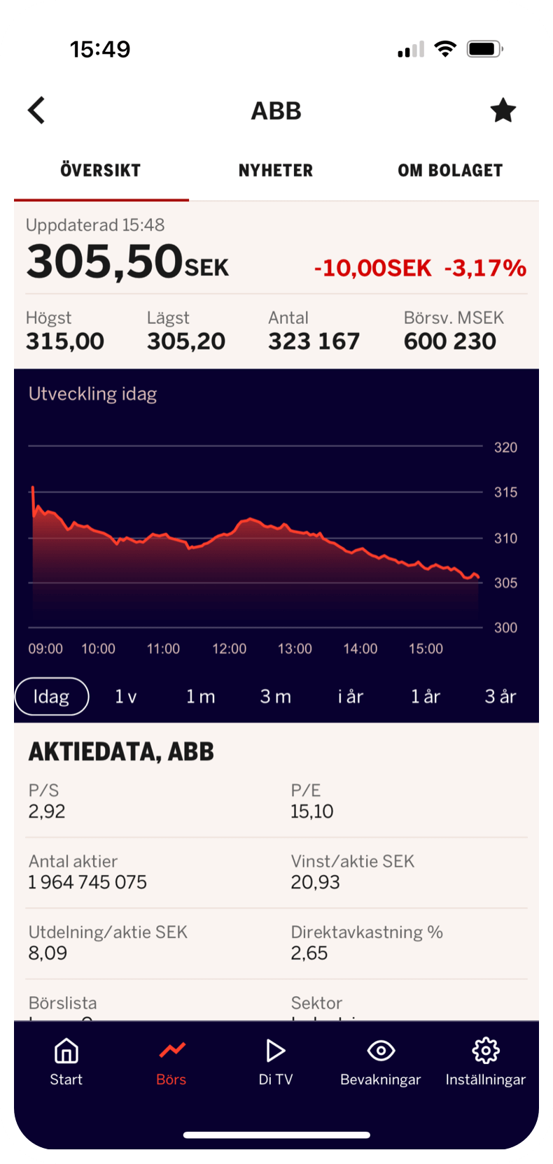
Stock screen / After
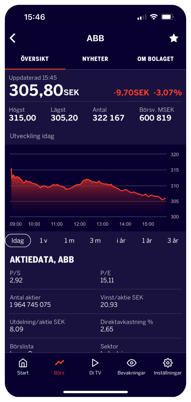
Stock screen Dark / After
Selected Works